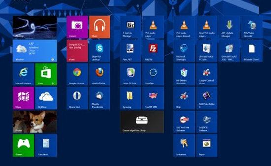
Windows 8 is somewhat a diluted mix of good and bad features, whilst more secure it’s not the easiest to get to grips with, but one thing’s for sure, it looks gorgeous. Whilst all the um-ing and ar-ing has been going on over what’s good and what’s not between the forums, Windows have been working on Blue.

They used to release big patches like in Vista, the service packs, these used to be huge in size and used to do little to the actual working of the operating system that most users could tell. But Microsoft look to change this. Blue is their new way to update. Whilst users and developers alike are finding new things by metaphorically put their ear to the door this is what they’ve found out so far.
Windows Blue could be 8.1, but it also might not be.
It’s speculation but Blue is a codename used by Microsoft for the project. Originally it was said that it could be the hallowed Windows 9 but this was shot down. Recent sources have said that it might be called 8.1. So whilst it’s not a totally new Windows platform it is going to be an updated version of the Windows 8 wave OS.
The return of the start button
It’s a crazy thought that the start button might be returning to the Windows 8 platform, during my time using Windows 8 I did miss trawling through my list of programs to find the one I was looking for. But it won’t be anything like that apparently, the button will only take you to the start menu as Windows 8 is set now instead of the already existent method.
In a press release Microsoft stated that the button was removed because of a poll result indicating that it wasn’t really used much anymore. Upon it being removed there has since been a rather large call for it’s return, mainly from older users who can’t get the hang of the new fangled darned Windows systems. A company StarDock has released an application that replicates one that is almost identical to the Windows 7 one, but it’s costs $5. But I mean if you miss it that much, that’s a small price to pay for happiness.
Boot to Desktop!

This is what Windows 8 users currently boot up into
Do you miss your desktop, are you longing to not see the big colourful tiles when you boot up, and desire to see your great HD background? Then this could be your lucky update! One developer was searching through the code and found a few lines that suppress the start screen and open into the desktop.
It’s been another aspect of the Windows 8 interface where Metro, there tile system, was a bit of a jump from Windows 7 and has actually been blamed for the drop in PC sales. Whilst the start screen is nice, there’s something homely about having your icons and a background on show. A few tutorials have been made that show people how to make the Windows 8 system do this on boot, but having an option will let the lesser have it easy.
Some people feel windows might have gone full circle with this but by sounds it’s just a Service pack with a few minor software updates, and some updates to aesthetics to appease the crowd that yearned for their start menu’s back. We will just have to wait and see when it’s released in July/August.
What do you think? Is this Microsoft’s new operating system with the biggest cover up in history, or is it just another service pack PLUS extras?


2 Comments
There’s been a lot of debate around Windows 8 and it’s new interface. I for one didn’t mind it at first but as time went on I became increasingly frustrated with it.Â
It isn’t very intuitive without touch gestures and even with, it leaves a lot to be desired. The start button most definitely should have been made easy accessible from the start, with or without the new design – but that’s just my opinion anyway.
fabiovirgi I think the problem here is not just the button been placed there, that is just interface aesthetics, it needs to be functional and back to why people liked it, if they were to include it now and it simply takes you back to the tiles, that would defeat the purpose, it needs to a button that takes users to that good old start menu we all loved.